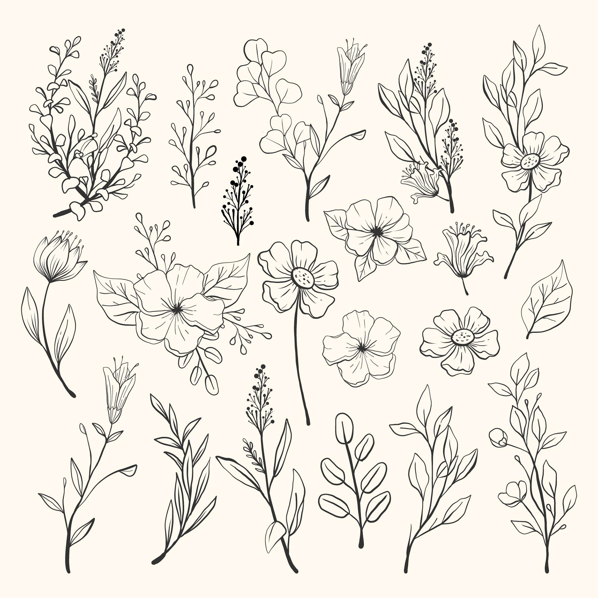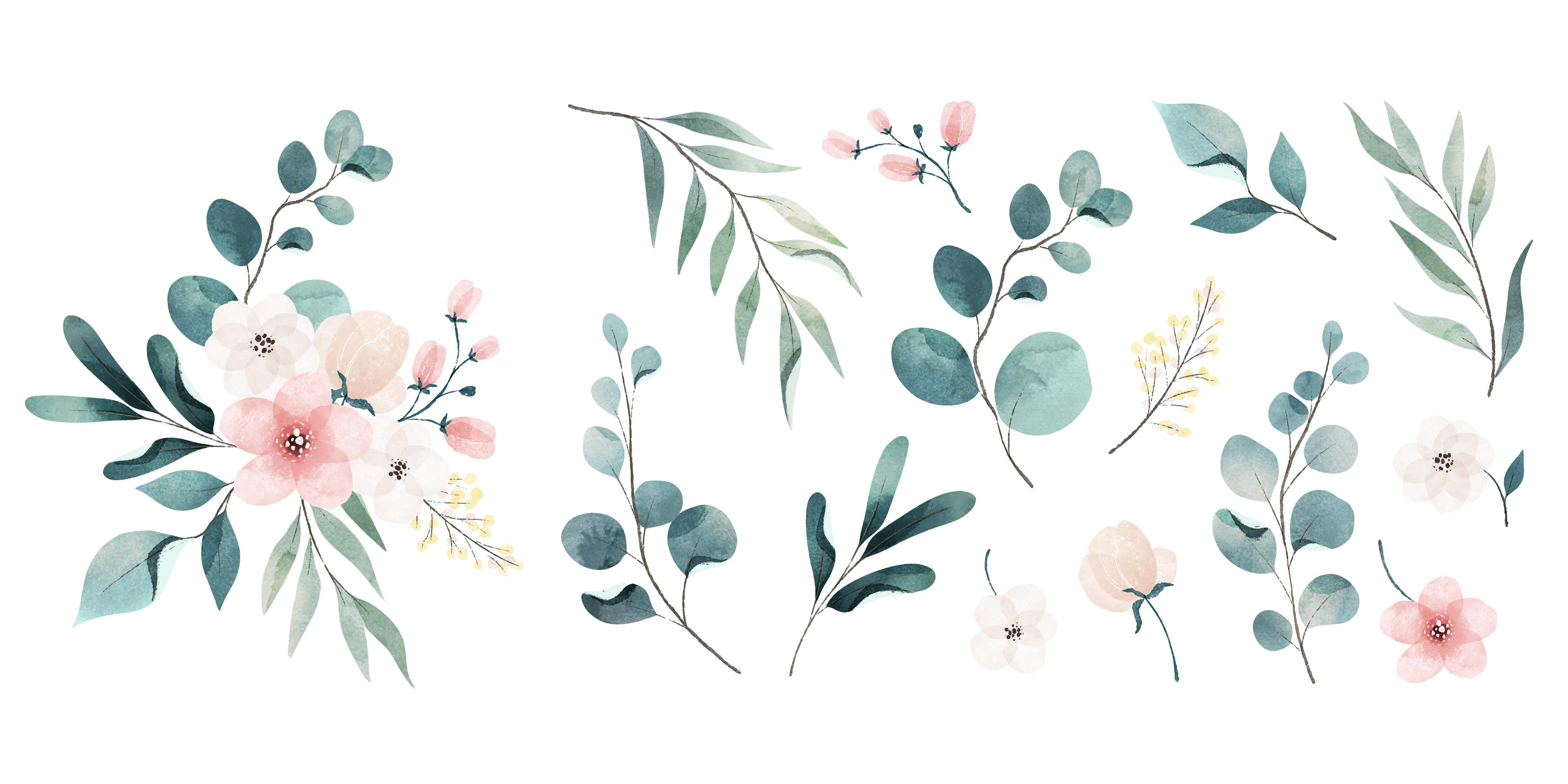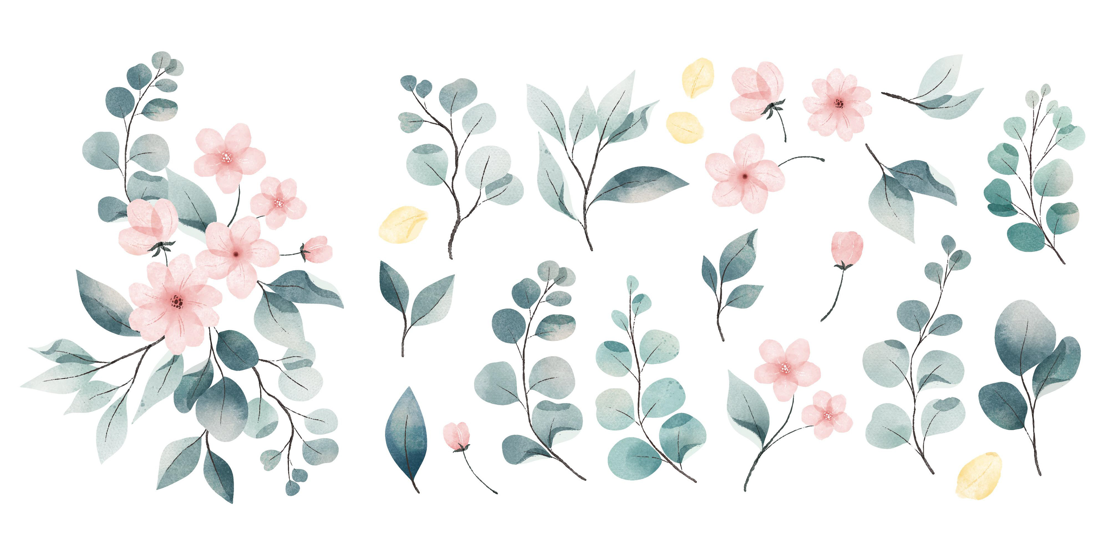
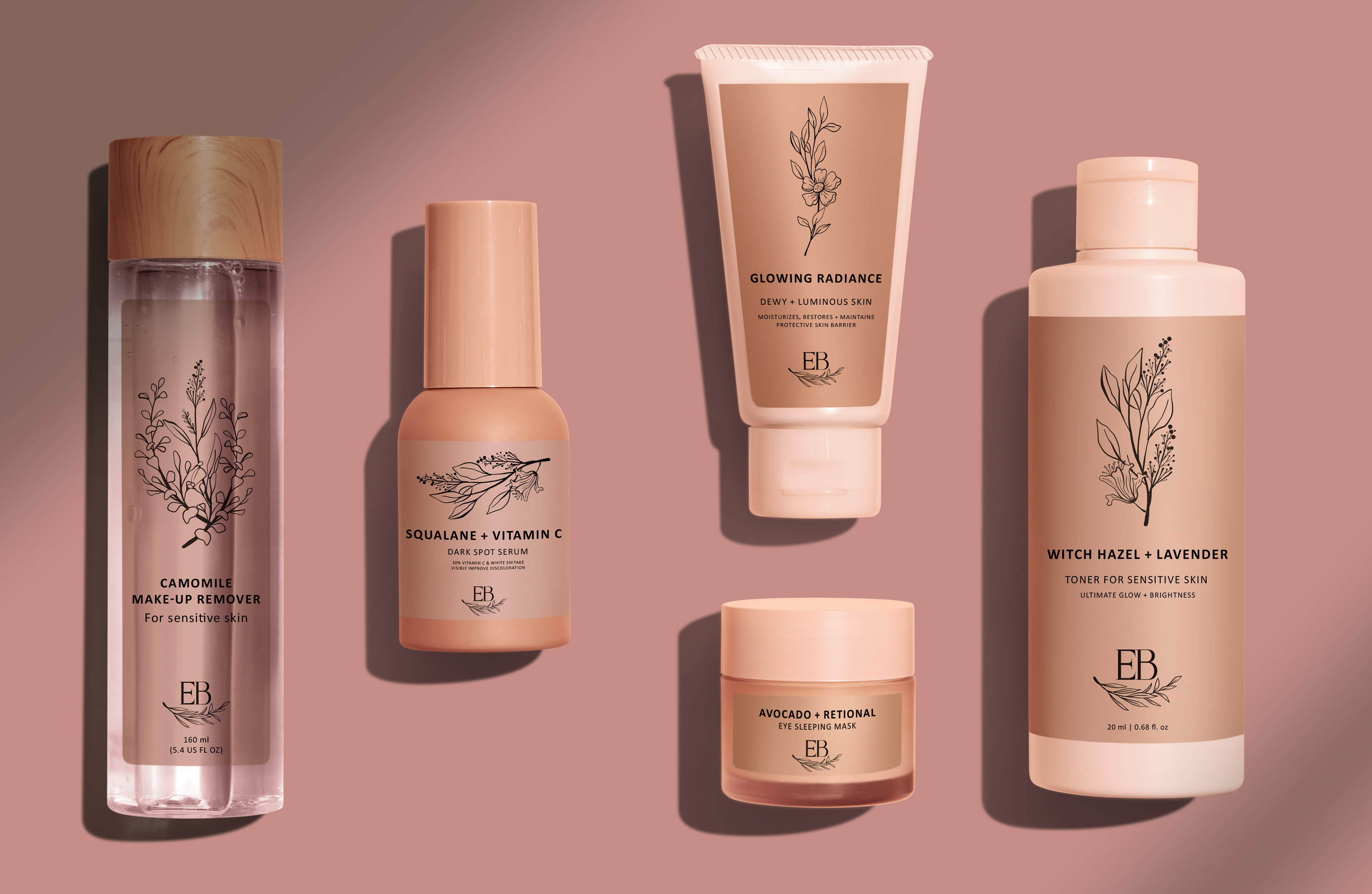
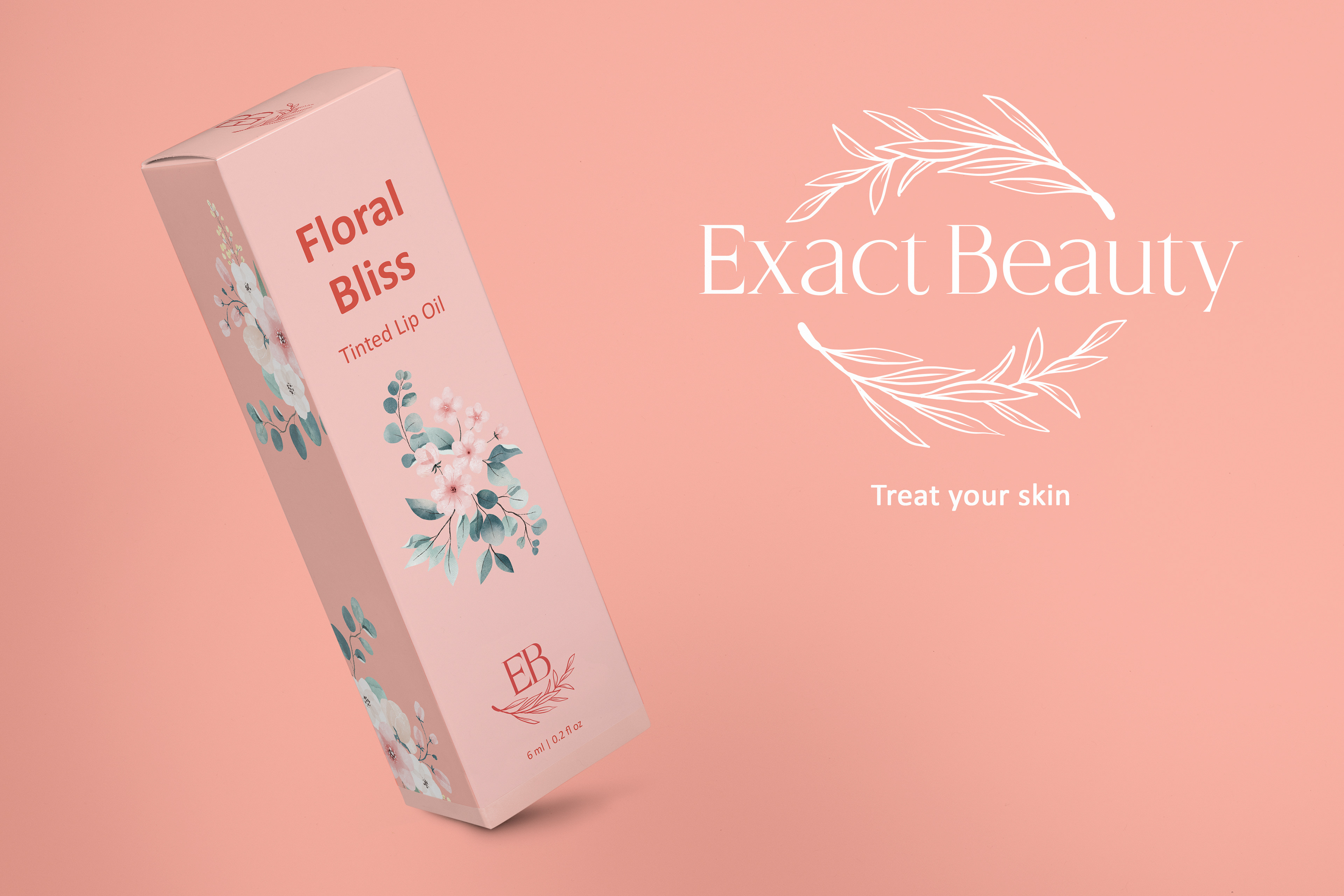
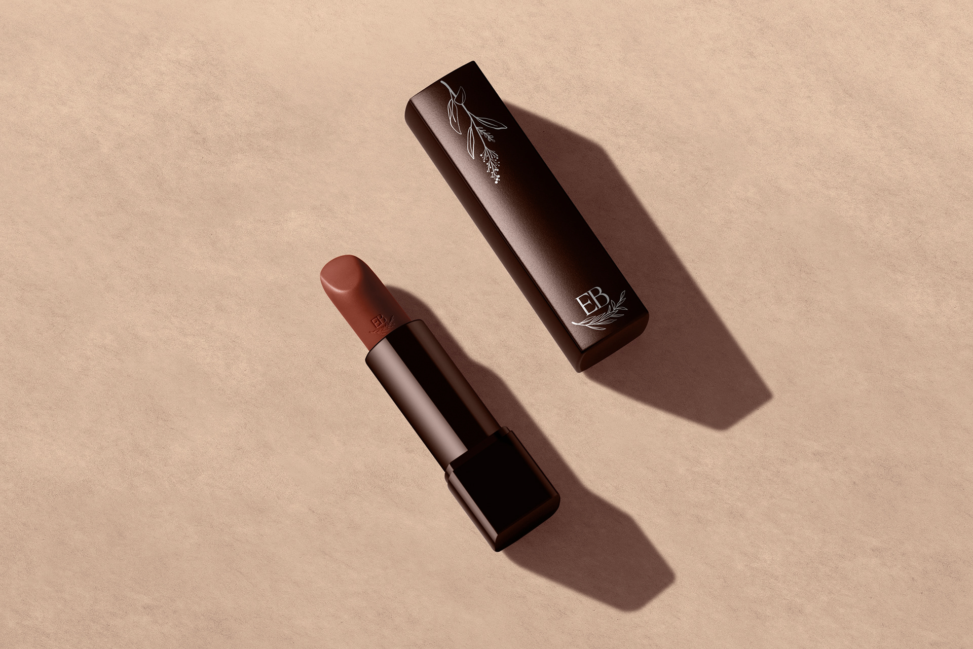
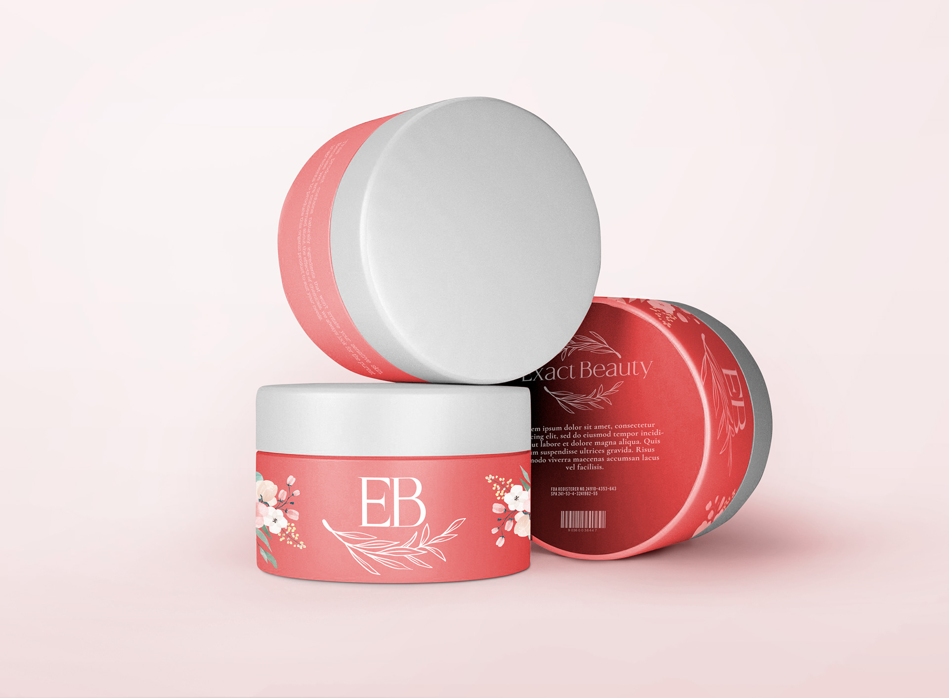
The goal was to give Exact Beauty a feminine look that is both elegant and simple at the same time. Wanting to avoid any overcrowding of designs on the bottle and flashy imagery. The main imagery that’s used in the actual branding is florals.
Software Used: Illustrator, Photoshop
Branding
To keep that light and airy feeling, light pinks were chosen for the main colors and silver chosen for any embossing/foiling to differentiate from any competition, where gold is overused.
The typography picked was chosen to give a slight whimsy to the logo and some headers, while majority of headers and all body copy was kept to a simple and legible sans-serif to be more inclusive.
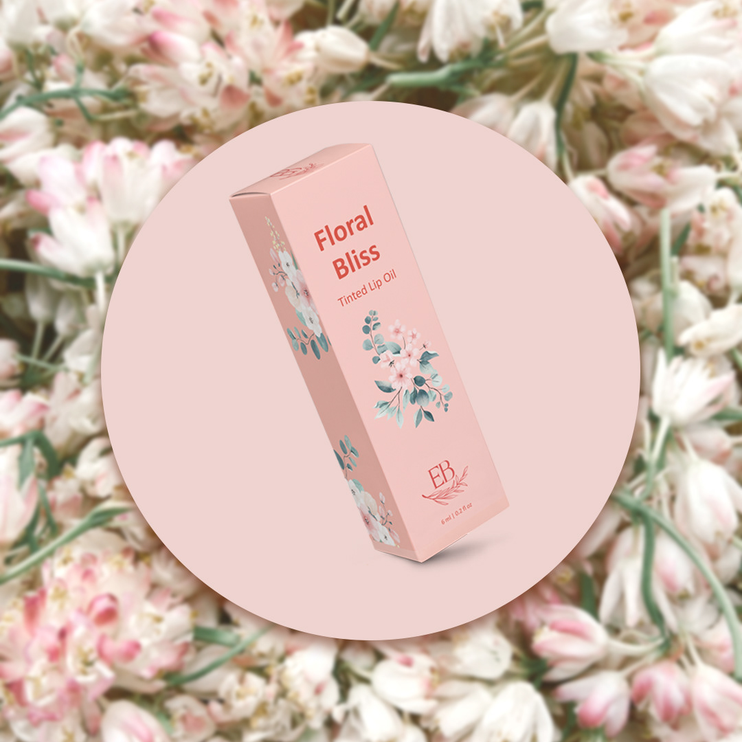
Package Design
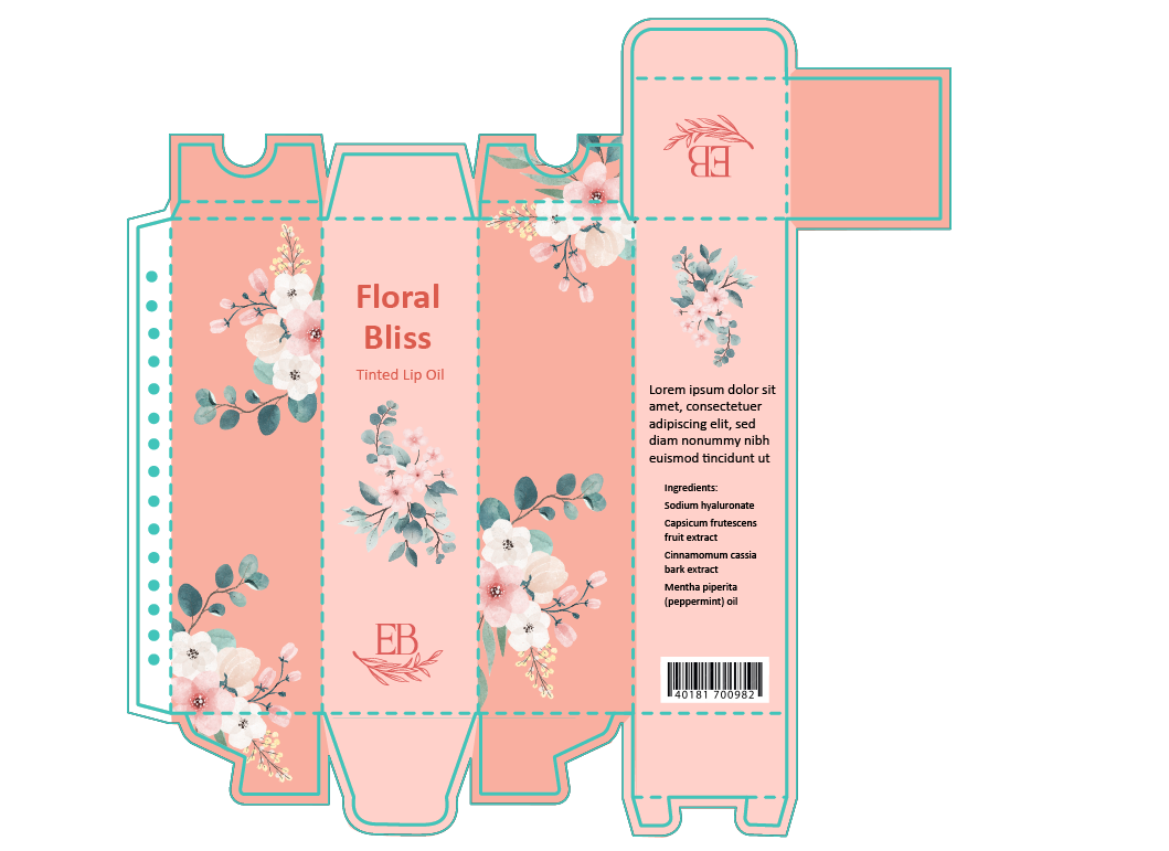
Elegant and feminine are the two main traits for the packaging. The title fonts can be either Quinstory or Calibri as they are both brand fonts. The body must always be Calibri regular. The colors should incorporate the minimal color palette and incorporate the illustrations in someway.
The goal is eye-catching but not distracting.

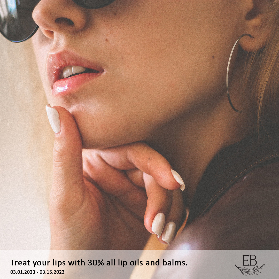
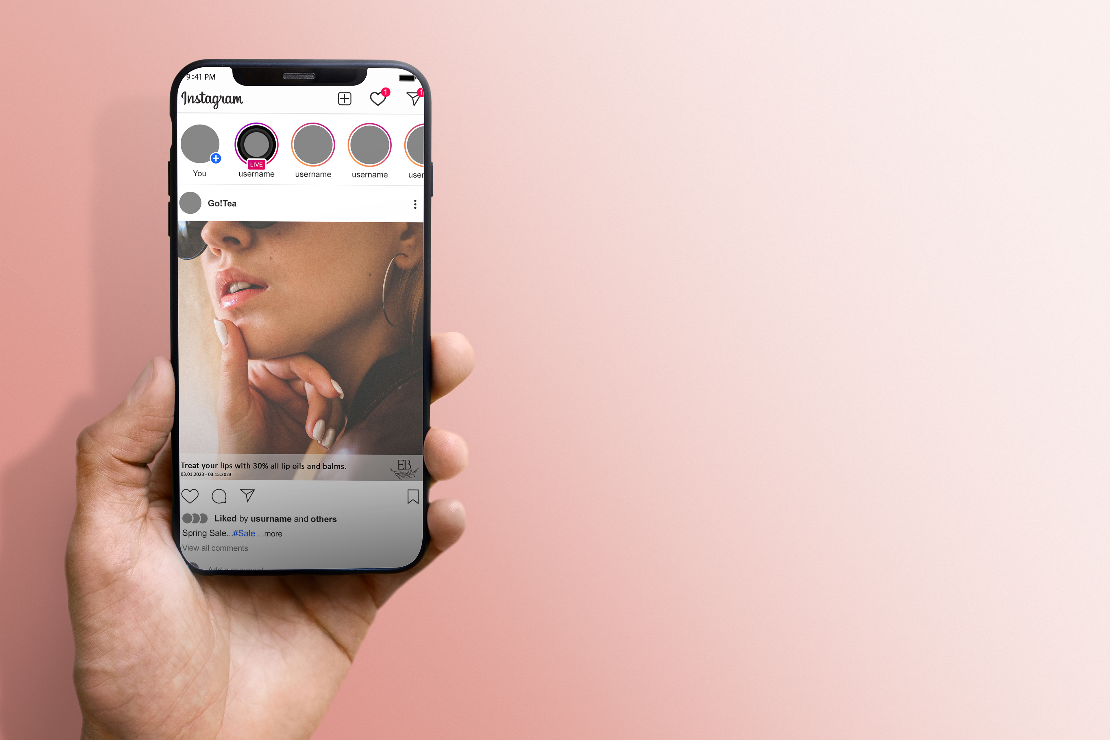
Social Media
For social media, templates will be supplied for creating the different types of posts. There are more heavily styled posts such as sales, new products and slogan posts. However there is also an emphasis on creating personal posts through reviews or demonstrations and customer photos.
There is a high emphasis on using reels to help drive these more personal posts.

Assets
The two type of illustrations to be used on any branding or packing are fine line floral illustrations or watercolour floral illustrations. This is to help create an air of fun and whimsy, as well as creativity.
These are to be used sparingly and never overcrowding the important information on products directly and can be used more freely on the boxes and packaging the products are sold in.